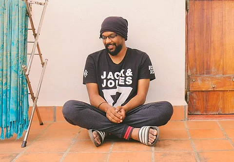

From littering the streets with leaflets in the name of promotion to now getting posters affixed on aeroplanes and hot air balloons, advertising, quite literally, has gone sky high. Meet Gopi Prasannaa, the man behind the logo and designs of many films including Yeman, OK Kanmani, Kaatru Veliyidai, Vikram Vedha, and most recently, Mersal and Dhruva Natchathiram. Gopi’s particularly excited about Mersal, his third collaboration with director Atlee, whose Raja Rani and Kaththi he worked on.
The title design of Mersal has already had a lot of people on social media analysing it, and coming up with various interpretations. Among other things, it’s said that the title resembles a bull, that the numer 61 is incorporated into it (the film was called Vijay 61), and that when the title, when read upside down, reads ‘Vijay’. Gopi laughs, astonished. “To be honest, I definitely didn’t plan on including such elements in the design. In fact, I didn’t even intend originally for it to look like a bull,” he says. “The art work usually ends up taking a shape of is own, and begins to incorporate meanings we don’t necessarily atribute. Only after I read these posts online, did I begin to understand that such meaning could be derived from the the title’s look.”
There’s also been some talk about the title design of Vivegam, his first collaboration with actor Ajith and director Siva. “Siva sir told me that time plays a big part in the film, and hence, I decided to bring in this time element into the title design,” he says. “We wanted it to look modern, and the idea of seeing a Tamil title in a digital font seemed interesting.”
It’s important for Gopi that he know the full story, so he can create an appropriate title design. “In Vikram Vedha, for instance, the swirls in the Tamil letters, ‘Vi’, and ‘Th’ symbolise the sword of Vikram and the tail of Vedalam, respectively,” he reveals. “Meanwhile, for Bala’s Paradesi, as it was a period film, I created its title from fonts taken from old Tamil documents.”
It all started for Gopi when his friend Thiagarajan Kumararaja asked him to help him out on the title design of his debut film, Aaranya Kaandam. “The yellow-and-black posters of the film have become popular since,” he says. His work, however, doesn’t stop with creating titles. “It begins when the director first pitches his work to the producer. We are then part of everything including designing standees, boardings, newspaper ads and web creatives. It’s much like how a corporate company does branding."
He expresses amusement at this latest trend of fans trying to decode deep meaning from title designs. “Some people tried to find numbers in the Vivegam title, and wondered if it meant anything,” he laughs.